Choosing n different colours for graphs
One way to generate a palette of colours for distinguishing different lines and objects in diagrams is to take regular steps around the hue parameter of the HSL colour wheel. If you know how many you’ll need then your can subdivide the space evenly, or if you do not then you can use 1/φ as the interval instead. But this has limitations…
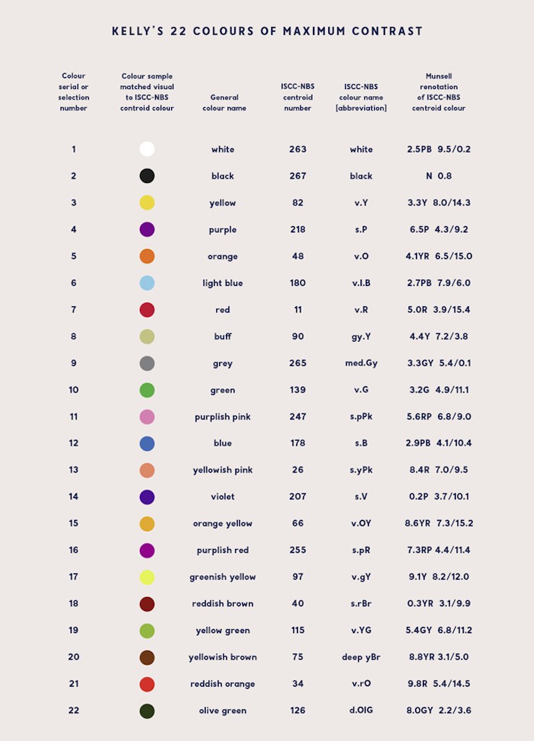
Of course a much simpler solution is to just pick a bunch of reasonable colours and put them in a table (eg., 1 2 3). But doing things the hard way is more interesting. Also, a list which includes both black and white isn’t solving quite the right problem for this post…
Spoiler alert: this won’t (directly) attempt to address accessibility for colour-blind users.
I’ve written in the past about trying to draw diagrams
and graphs on web pages. The essential point is that you can embed SVG
with a transparent background but you must use currentColor as the pen
colour when you do this, so that the image is drawn in the same colour
as the text, rather than assuming that the background is always white so
you need to draw black on top. If you use something like Dark
Reader you’ll often see this go awry.
Alternatively you can force the background of the image to be a known colour, but then on a contrasting background that can still be hard to look at.
So I know how to draw lines with reasonable contrast from the background, without assuming that the background will be light or dark. The next problem is to add to that palette some extra colours which also contrast with the background but are visibly distinct from each other. Like three lines on a graph.
Single-parameter variation
A quick-and-dirty notion of “contrast” is having a different brightness. Having a different colour but the same brightness can be very hard to look at. So for starters, let’s look at just varying the colour while keeping brightness at a single value chosen to contrast with the text or the background.
$\frac{n}{\varphi} \mod 1$ has the property that every new $n$ falls inside one of the largest gaps, and inside the largest span of contiguous largest gaps (when there are many largest-equal gaps), etc., subdividing that gap/span by 1:φ, which is tolerably close to 1:2.
That is to say that each new value is as far as possible from as many previous values as possible without deciding in advance how many values you’ll need or changing step sizes at different stages in the sequence.
Anyway, let’s have a look. These colours step around the hue of the HSL space:
It’s interactive. You can resize the box to change the way rows line up, so you can put different colours next to each other for comparison.
And if you do that you’ll see a problem. It seems to visit relatively few colours before coming back around to use something very similar to a colour that’s already been used. So things get indistinct much sooner than one might hope.
Fun fact: When taking steps of 1/φ mod 1 those “kind of similar” colours occur at distances which are Fibonacci numbers. Resize the box to have a Fibonacci number of columns and you’ll see stripes.
HSL is tied to the numerical coding of colour in RGB. It’s made out of up and down ramps of R and G and B without regard to how they’re perceived. OKLCh, on the other hand, is tied more closely to human perception. Maybe that’ll help:
This has the unfortunate effect (normally a feature) of flattening the lightness of each colour, so none of the colours are distinguished by the perceptual lightness variations which would sneak through HSL. Maybe the hues are more evenly spread, but I can’t see it.
On the positive side, the contrast with the numbers written on the boxes is more even. That’s important.
Another problem with OKLCh is that it’s so easy to stumble out of gamut (the range of colours which the display can represent) and this brings gamut mapping into play. The way to do that is not well defined right now and it may never be defined in a way that’s useful for these purposes. It’s not always obvious how and when the test swatches I’m using here will be clipped to fit the display capabilities, so it’s hard to be confident that everybody sees the same thing.
That’s a problem with human perception anyway, but this makes it so much worse.
But let’s persevere with it a while longer…
Multi-parameter variation
Changing just the one parameter doesn’t seem to get us a lot of distinct choices. The next thing we can change without interfering with our fixed brightness constraint is saturation, or C for “chromatic intensity” in OKLCh. Alternatively, C represents the distance which the a (green-red) and b (blue-yellow) values are from 0,0 in OKLab, so we could vary a and b instead of C and h.
So how do you get the properties of $\frac{n}{\varphi} \mod 1$ in two dimensions? It turns out a (the?) generalisation takes us to the plastic ratio (ρ=1.3247), next. In short, multiply $n$ by (1/ρ, 1/ρ²), or (0.7548776662, 0.5698402910) mod
- This maximises the minimum distance between any two points in two dimensions.
Here’s how that looks in OKLab:
This gives uniform coverage of a square in the chroma plane, so it has pointy corners where the saturation reaches further out than it can near the edges. It’s probably going out of gamut and being clipped in unpredictable ways.
In another problem space we could use rejection sampling to avoid those ugly corners, but then we can’t define a colour as a simple function of $n$. Instead, a technique to map two uniform random values (a square) to a uniform distribution over a disc is to take one value as the radius and the other as an angle around that circle. Squaring the value used as radius compensates for the over-concentration of points around the centre (proof left as an exercise for Google search).
Does this retain the mathematical rigor of low-discrepancy sequences? No. Not at all. But it’s the best I have right now.
And here’s what that gives us for OKLCh:
Something really unfortunate about the plastic ratio shows up, here. It’s too close to 4/3. This has the consequence that one parameter appears nearly periodic mod 4, with a very slow precession. For example, in the polar test case, we start at 0 so the first radius is zero (grey), and every fourth colour after that is very close to grey as well, and it takes a long time to climb out of that hole.
By switching the axes around then the problem will manifest in the hue instead:
For completeness, let’s also try OKLCh but with fixed C and varying the lightness instead.
Or swapping the axes:
Varying all three parameters
Next step is to make adjustments to all three parameters; but only modest adjustments so that all results still have strong contrast with the background colour.
I don’t know of a name for what comes after Golden and Plastic, but its value is g=1.22074408460575947536, and the reciprocals of the powers are (0.8191725134, 0.6710436067, 0.5497004779).
The lightness figure needs compression to ensure things don’t wander too far and start failing to meet the original contrast limitation.
But I preferred the result with the terms in a different order:
I wasn’t sure about the appropriateness of compressing an axis of an LDS the way I was doing it, so I tried using a smaller modulo instead:
but this version becomes distinctly worse at intervals of 22. Which is respectable, but it’s not as good as the previous version.
Those are all OKLab, so they have pointy saturation corners – though I did reduce the range a little to compensate. Let’s try another OKLCh:
And back to HSL:
And HSL with the axes rearranged:
So many choices… also, you can add some arbitrary starting value to pick a handful of colours you like the look of, and the subsequent colours will only come up in extreme cases.
Putting it into context
Given some function or other to turn an index into a colour, that colour still has to make sense for the way it’s being used. Coloured lines want contrast with the background while being distinguishable from each other, but if you fill in a box you probably want that fill to have contrast with any text that goes inside, so it should be close to the background colour.
In my totally unscientific tinkering I’ve found that low-saturation light colours (pastels) work well for lines on dark backgrounds and for fill colours behind dark text, and that high-saturation dark colours (“deep” colours) work well well for lines on light backgrounds and fill colours behind light text.
Also, fills turn out to be easier to distinguish from each other than lines, so lines might need their saturation amplified a bit to compensate. Maybe. I don’t want to go that deep right now.
All that said; one should have other means to distinguish things because not everybody sees colour the same way.
Code plz!
In CSS you can deduce a contrasting background colour with something
like: HSL(from currentColor 0, 0, clamp(0, l * -100 + 50, 1)) This
negates the luminance and amplifies 100-fold so as to hit the limits
imposed by clamp() right away. Resulting in either black or white
being chosen.
One can also deduce that a low saturation might be desired when
currentColor has a low lightness value, and high saturation is desired
when currentColor has a high lightness value.
It’s easier to do this in two steps, first making a “mask” colour, and then using that mask as the basis for palette colours:
* {
  --stroke-mask: oklab(from currentColor
      clamp(.40, l *  100 - 50, .9)
      clamp(.15, l * -100 + 50, .3)
      clamp(.15, l * -100 + 50, .3));
  --fill-mask: oklab(from currentColor
      clamp(.40, l * -100 + 50, .9)
      clamp(.15, l *  100 - 50, .3)
      clamp(.15, l *  100 - 50, .3))

  --colour-stroke: oklab(from var(--stroke-mask)
    calc(calc(mod(.6710436067 * var(--n), 1) - l) * .25 + l)
    calc(calc(mod(.5497004779 * var(--n), 1) - 0.5) * a)
    calc(calc(mod(.8191725134 * var(--n), 1) - 0.5) * b));
  --colour-fill: oklab(from var(--fill-mask)
    calc(calc(mod(.6710436067 * var(--n), 1) - l) * .25 + l)
    calc(calc(mod(.5497004779 * var(--n), 1) - 0.5) * a)
    calc(calc(mod(.8191725134 * var(--n), 1) - 0.5) * b));
}
Where --n is an integer colour index. Just set --n to different
numbers for each group of objects which should have the same colour, and
use var(--colour-stroke) and/or var(--colour-fill) as appropriate
within that.
TODO: here’s where I’d demonstrate boxes and lines in different colours, and on different backgrounds, but I don’t really have time right now.